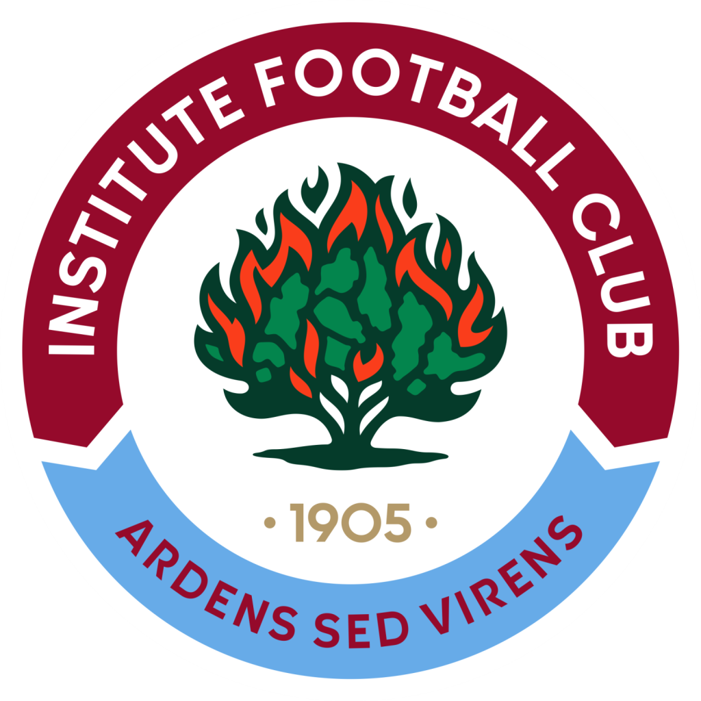
Institute FC is proud to announce the unveiling of its newly updated club crest, blending tradition and familiarity with a contemporary twist. The new crest, which was the result of extensive consultation and feedback from board members, club supporters, and other stakeholders, aims to represent the club’s rich history while embracing a modern aesthetic.
Along with retaining the three key features of the existing and previous versions of the crest 98% of respondents were keen to add our year of inception, 1905. Previous iterations of the crest were also discussed with those long associated with the club.
The previous crest, although dear to many, was beginning to show its age and the overall design lacked the clarity and impact we wanted. We explored various design elements from other clubs and historical references, settling on a circular style that incorporates a dual banner, which was well-received during our consultations.
Feedback from club members and supporters played a crucial role in shaping the new design. “A new crest should embody modern design without destroying the legacy and history of the club. It needs to be a perfect blend of modern and traditional,” one supporter commented. Another emphasised, “We must move with the times and have a modern fresh look while retaining the history of the club but ensuring it is easily recognisable as Institute FC.”
The aim was to create a crest that feels both familiar and fresh. We wanted it to resonate with our loyal supporters while appealing to a new generation of fans.